In my current job I maintain a research institute website that’s been around for awhile and will (goddess willing) continue to stick around, so I’m always looking for ways to future-proof the codebase to go the distance. One way I make the site more maintainable is by updating its codebase to take advantage of modern CSS, especially in places I can reduce dependence on third-party frameworks.
My previous post proclaimed the power of native CSS to create adaptive and responsive image galleries. This post continues in the theme of writing techy love letters to modern CSS layout tools, but this time I’ll focus on using CSS Grid to recreate a Bootstrap layout.
Lining up layouts
I recently worked on a project involving a grid-style layout of cards holding calendar event info. My task was to add a new, separate data stream of calendar events below the existing one. To maintain visual consistency, I needed to match the responsive behavior of the new calendar section to the old, creating a seamless grid between sections and across viewports.
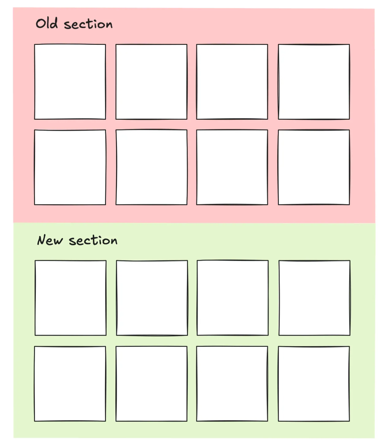 Two separate sections, same grid layout
The Bootstrap version
The existing calendar section used Bootstrap to arrange events (list elements) into a responsive grid:
<ul class="row">
  <li class="col-sm-6 col-md-4">...</li>
  <li class="col-sm-6 col-md-4">...</li>
	.
	.
	.
  <li class="col-sm-6 col-md-4">...</li>
</ul>
For anyone unfamiliar with this layout tool, Bootstrap is a CSS library that works on a 12 column grid system. The way you make responsive layouts is by using classes to tell the browser how many of those 12 columns an element should take up at different predefined breakpoints.
In the above HTML block, the row class is a special Bootstrap container class used to hold “column elements” (<li> elements in this case). The responsiveness of the column elements in this particular example is defined by two Bootstrap classes:
- The
col-sm-6class makes the element 6 columns wide, or half the container width, at small (sm) screens. - The
col-md-4makes the element 4 columns wide, or one-third the container width, at medium (md) screens.
There’s actually an additional hidden breakpoint for small screens. By default Bootstrap stretches column elements to 100% the width of the container whenever the viewport falls below the smallest breakpoint (which happens to be 576px), creating a single column of stacked elements. It’s like there’s an implicit class of col-xs-12 applied to every column element.
You might be wondering, why fix something that ain’t broke? Why not just apply the same Bootstrap layout to the new calendar section and be done with it? And to that I say, where’s the fun in that? Practially speaking, CSS Grid is far more powerful than Bootstrap1, and as I hope to show here, makes for a neater & more maintainable codebase.
The improved Grid version
Here’s the layout implemented with CSS Grid that results in almost the exact same (I think slightly better) responsive behavior as the above Bootstrap version.
<ul class="max-4-grid">
  <li>...</li>
  <li>...</li>
	.
	.
	.
  <li>...</li>
</ul>.max-4-grid {
display: grid;
grid-template-columns: repeat(auto-fit, minmax(max(260px, 100%/4), 1fr));
gap: 1.5rem;
}At first it can look like an unappetizing parentheses salad so let’s break down the nested functions of the grid-template-columns line.
repeat + auto-fit
With the repeat and auto-fit combo, we’re telling Grid to place as many equal-size column elements as will fit within the Grid container. The auto-fit ensures that any overflowing elements will be wrapped to the next row.
Minimum element width
The size of the individual grid elements placed by auto-fit is controlled by the minmax(max(260px, 100%/4), 1fr). It may seem confusing that we’re using a max function to set the minimum element width, but this setup allows us to set both an absolute and a relative minimum size.
The max(260px, 100%/4) function specifies that an element cannot shrink smaller than 260 px wide or 1/4 the container width - whichever value is larger. Functionally this means an element can never be narrower than 260 px (absolute minimum) and also limits the grid to no more than 4 elements per row (relative minimum).
A sidenote: In practice, I never get more than 3 elements per row with this Grid columns logic. Glossing over the math of why2, this is due to the sneaky added width from gaps, padding, margins, etc., and the fact that I had set an absolute max width on the parent container.
Maximum elememt width
Each element’s maximum width is set to 1fr, or 1 “fractional unit”, which basically means “take up whatever space is available”. This bit of code allows the grid elements to stretch evenly across the container so that no empty space is left at the end of a row.
Fun fact: This Grid pattern that uses the magic seasonings of
repeat,auto-fill, andminmaxhas been around since the early days of Grid, as evidenced by its appearance in the 2016 W3C Working Draft for Grid.
tldr;
To summarize the grid-template-columns logic:
repeatandauto-fitplace as many equal-width elements as will fit on a row(max(260px, 100%/4)sets minimum element width to 260px or 4 elements per row, whichever is larger1frlets elements stretch to fill up any extra row space
🎵 Anything Boots can do Grid can do better 🎵
Using CSS Grid to build layouts like this provides many advantages over Bootstrap, particularly when it comes to large projects with longevity in mind.
1. Greater flexibility
Grid is more flexible across pages and projects than Bootstrap. It requires no media queries or hard-coded breakpoints locked to a 12-col grid. For a real showstopper of a layout contortionist, you can even combine Grid with container queries (oooo aaaahhhh).
2. Visual balance and space efficiency
No empty space is left at the end of a row whenever there are fewer elements than can fill a row. This is what I meant when I said the Bootstrap and Grid layouts are almost exactly matched: the Bootstrap version creates empty row space while the Grid version allows elements to stretch and fill the row.
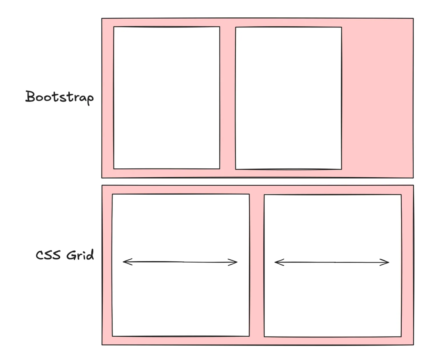 Bootstrap = rigid elements and unclaimed space; CSS Grid = stretchy elements that fill the row
3. Native CSS >>> 3rd party dependencies
The Grid implementation relies on native CSS instead of third-party framework tools. That means fewer dependencies and smaller bundle sizes. In my playbook, every small step towards escaping dependency hell is a major win. Plus it makes the layout easier to transpose into other projects where Bootstrap is nowhere to be seen.
4. Cleaner, plug-and-play code
Grid makes for more concise HTML, streamlines editing, and reduces “class soup”. The Grid layout class is plug-and-playable across the codebase as a single class that gets applied once to the parent grid element. Whenever I need to tweak this layout, I only need to change it in one place in the CSS.
With Bootstrap, I have to comb through the HTML to add/change multiple Bootstrap classes (class="col-sm-6 col-md-4 col-lg-3") on every child element. No thank you, that’s precious time I could’ve spent writing more love letters to CSS Grid.
5. No breakpoints
Compared to Bootstrap’s breakpoints and columns, I find CSS Grid easier to think about in design space.
Working with Bootstrap requires thinking in two different layout dimensions: 1) the predefined breakpoints in pixel space that are based on the viewport size, and 2) the 12 columns in virtual “grid space” used to arrange elements within row containers. Breakpoints determine when to change layouts, and columns determine how the layout changes.
In contrast, Grid can be conceptualized in a single layout dimension - the grid itself. What’s more, the grid’s spatial definition is flexible which allows each developer to work in a way that’s intuitive to them. I can choose to define grid elements using absolute or relative units, or a mix of both. And I have the option of using media queries to introduce breakpoints if that’s how I prefer to work.
That’s all!
With all these benefits over Bootstrap, I will continue to reach for CSS Grid as my go-to layout tool and look for opportunities to overhaul Bootstrap code in favor of modern CSS.
Further reading
-
Official W3C specification for CSS Grid
-
Sara Soueidan’s CSS Tricks article from 2022 breaks down the Grid
auto-fitvsauto-fillbehavior -
The focus of this exercise was to recreate one specific layout using CSS Grid. If you are interested in recreating a flexible and modular 12-column Bootstrap copycat using CSS Grid, MDN Web Docs shows you how.
Footnotes
-
Don’t get me wrong, Bootstrap is an amazing tool. I used it to build my first few websites and will continue to sing its praises as a wonderful starting point to learn responsive design or quickly launch a prototype. ↩
-
tldr; spacing between elements often means that only n-1 elements will fit in a row. The longer explanation as to why we only get 3 instead of 4 elements per row has to do with container constrains and padding between grid items. The max conatiner width is set at 1200px. Based on our Grid logic, that means the maximum width of an element is 1200px/4 = 300px. But that doesn’t include spacing like grid gaps, which I had set to 1.5rem (24px). When we add 3 grid gaps between 4 cols, we get an extra 24px * 3 = 72 pixels that need to fit inside the container, making the total width required 4 * 300px + 72 px = 1272px. This exceeds the capactiy of our 1200px container, so
auto-fitbumps the fourth element to the next row, and we never see more than 3 elements per row. ↩