The more time I spend learning and working with CSS, the more I fall in love with it. That love doesn’t always come easy, though, as I often have to trudge through some madness to reach the magic.
Like the time I toiled away for hours trying to build the perfect, responsive, CSS-only image gallery only to later discover that (spoiler!) I could tame the beast with a single line of code.
When I first learned of this magic bullet it filled me with a frenzied mix of rage and flabbergast. That night, I skulked around the house stuck in loop, shaking my head muttering “one line of code” and laughing exasperated, “Can you believe it? ONE LINE?!” while my partner eyed me warily and asked if he could get me some cheese.
Once the manic brooding passed, I was able to see that those hours of questing after my holy grail of image galleries were not a waste of time. The exercise of defining criteria and applying them to each gallery iteration deepened my understanding of CSS layout tools. I left the dungeon with not just one but a handful of image gallery components to wield in future projects.
🖼️ Gallery criteria
This quest grew out of a client request for the ability to upload a bunch of images and display them together like a collage within a blog post; in other words, a magic hat to dump piles of non-uniform images into and get back a neatly arranged scrapbook page.
This gallery needs to be flexible and “self-sufficient” as specified in the following criteria:
- Adapts to any number of images uploaded by the user
- Accomodates varying image dimensions, ideally without forcing an aspect ratio
- Requires no user input or oversight regarding image arrangement or custom attributes
- Relies on 0 Javascript, (always my preference as a zealot of Andy Bell’s “Be the browser’s mentor, not its micromanager” dev principles)
- BONUS: Even edges or, in the very least, a sense of balance along the gallery’s outer edges
🧱 Masonry layout
Given the criteria, the layout that immediately pops into my mind is what folks refer to as a masonry layout. Masonry layouts are sometimes called Pinterest layouts as they were popularized by the now forsaken AI-infested platform of the same name.
A masonry layout places images across multiple columns, presenting an eye-catching collage of images to the viewer. (At small screens, the gallery collapses to a single column of stacked images so that their compositions don’t get too tiny.)
 A basic masonry layout
Notice that while the columns are all the same width, the height of each “brick” in a masonry layout is allowed to vary. This highlights two very important features of any masonry layout:
- it creates a waterfall effect, giving the container implied vertical movement
- it adapts to contents of varying height, allowing images to retain their particular aspect ratio.
With these layout features in mind, I’ll add one final criteria to my gallery component:
- Conveys a cascading, waterfall effect
Despite its popularity, the reigning CSS layout tools Flexbox and Grid do not yet provide a straightforward way of implmenting a masonry layout. The good news is this elusive rockstar of a layout is being spec’d for CSS as we speak (though its precise implementation is still up for debate.)
Until then I need to find another way to derive a masonry layout using only CSS.
🧬 HTML structure
Throughout my gallery experiments I’ll use the same HTML structure of an unordered list where each list element contains an image tag.
<ul class="[xyz]-gallery">
	<li><img src="image-1.png" alt="..."></li>
	<li><img src="image-2.png" alt="..."></li>
	<li><img src="image-3.png" alt="..."></li>
	<li><img src="image-4.png" alt="..."></li>
	<li><img src="image-5.png" alt="..."></li>
	<li><img src="image-6.png" alt="..."></li>
	...
</ul>
🧇 CSS Grid gallery
Let’s start by trying our hand with CSS grid. Here’s the core CSS (technically SCSS because I’m a nester 🪺) of the grid component I’ve named grid-gallery:
.grid-gallery {
  display: grid;
  grid-auto-rows: 300px;
  grid-template-columns: repeat(auto-fit, minmax(400px, 1fr));

  img {
      display: block;
      width: 100%;
      height: 100%;
      object-fit: cover;
  }
}
I’m setting a fixed row height of 300px and letting grid determine how many columns of 400px it can fit. Images are set to cover 100% of their allotted grid space.
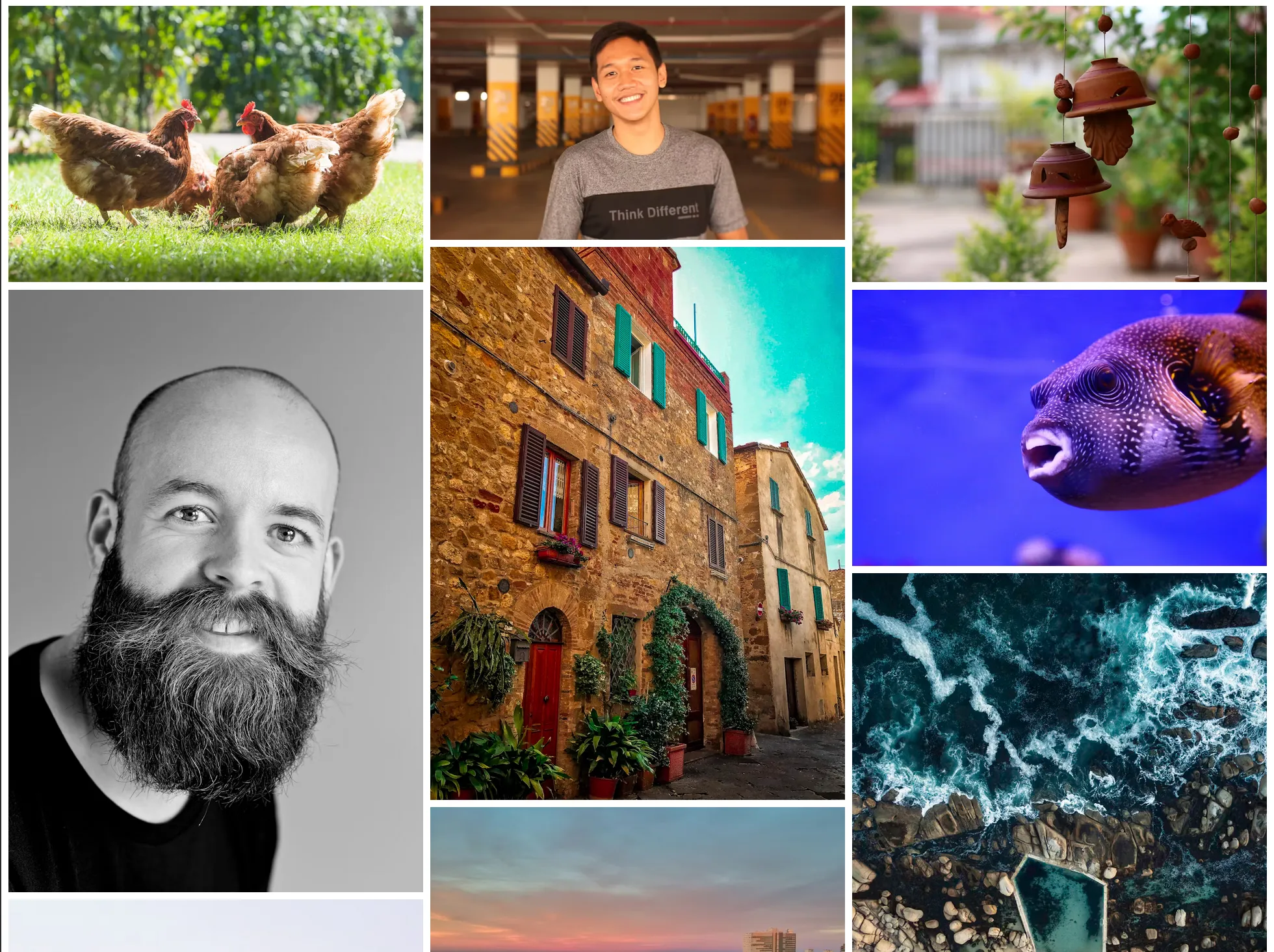
Here’s how the final grid-gallery looks:
 Grid-based image gallery tiling images to all share the same height and width
And here it is again as an embedded Codepen, for your tinkering pleasure:
Criteria check for grid-gallery
This component works and looks okay, but it’s clearly lacking on a few of my gallery criteria:
- ✅ Adapts to any number of images uploaded by the user
- ❌ Accomodates varying image dimensions, ideally without forcing an aspect ratio
- ✅ Requires no user input or oversight regarding image arrangement or custom attributes
- ✅ Relies on 0 Javascript
- ❌ BONUS: Even edges or, in the very least, a sense of balance along its outer edges
- ❌ Conveys a cascading, waterfall effect
Where it fails
By setting object-fit: cover on img elements, the images expand to fill up their alotted grid space, creating a tiled image gallery with even spacing. Unfortunately, using object-fit: cover can lead to some awkward art direction, a side effect that’s unavoidable particularly when forcing both landscape and protrait images into a one-size-fits-all frame.
Another less than ideal aspect of this CSS grid approach is the unbalanced last row whenever there aren’t enough images to fill every column. Some folks may not be bothered by this, but I personally think the blunt edges and empty space look a bit too blocky and unfinished.
Even when the grid elements do happen to create a clean edge, the images within the grid-gallery are too rigidly aligned - too “griddy” - to replicate the waterfall effect.
Bottom line
CSS grid is absolutely capable of having individual grid elements take up variable column or row spans, but these solutions require precisely mapping each image to a designated slot (check out Kevin Pennekamp’s image showcase for a fabulous example and explanation of this).
Final verdict: CSS Grid is too strict in its column widths and/or row heights to accommodate images of widely different aspect ratios.
💪🏻 CSS Flexbox gallery
Next I turned to CSS Flexbox. In contrast to CSS Grid, I figured Flexbox’s flex-wrap combined with a flex-grow of 1` could provide the squishing and expanding needed to allow wider images to be, well, wider.
Here are the crucial lines of code that form the basis of the flex-gallery element:
.flex-gallery {
 display: flex;
 flex-wrap: wrap;

 li {
     flex-grow: 1;
 }

 img {
   max-height: min(300px, 40vw);
   width: 100%;
   object-fit: cover;
 }
}
These few lines of CSS create an image gallery that looks neat as a pin.
 Flexbox-based image gallery nicely arranging images of varying widths
And the CodePen:
Criteria check for flex-gallery
Heck, that’s looking purdy good!
- ✅ Adapts to any number of images uploaded by the user
- 🚧 Accomodates varying image dimensions, ideally without forcing an aspect ratio
- ✅ Requires no user input or oversight regarding image arrangement or custom attributes
- ✅ Relies on 0 Javascript
- ✅ BONUS: Even edges or, in the very least, a sense of balance along its outer edges
- ❌ Conveys a cascading, waterfall effect
Thanks to its flexy nature, Flexbox moves us a bit closer to meeting all of the gallery criteria. In contrast with the Grid solution, images in the Flexbox version are allowed to occupy different widths, and the images reach to all 4 edges of the flex container for a full, balanced look.
While this flex-gallery doesn’t quite replicate a true masonry layout, I do think this is a solid and versatile gallery component. It’s super robust & responsive for any number, order, or aspect ratio of images you throw at it. I’ll definitely be reaching for this solution whenever I need a gallery that completely fills its container. Two thumbs up! 👍👍
Where it fails
There remains the stingy problem of awkwardly cropped images. This is perhaps most obvious with photos of text or landscape close-ups of faces, as seen here:
 I like to call this the “basement window crop” as it turns anyone from cute to creepy
Realistically, this cropping issue will only happen with certain photo compositions in a narrow range of screen widths. And given how well this flex-gallery performs otherwise, I’m more than happy to say good ‘nough and use this as a slap-and-go image gallery.
Another nitpick is that this flexbox gallery fails to capture the key visual gestalt of masonry layouts - the vertical, waterfall-like flow. Instead, the flex-gallery has more of a horizontal flow.
While neither flow direction is inherently better, the point of this exercise is to try to replicate the classic Pinterest layout. I could try using a flex-direction of “column” to create the waterfall effect:
.flex-col-gallery {
   display: flex;
   flex-direction: column;
   flex-wrap: wrap;
   max-height: 1500px;

 li {
     width: 200px;
 }
}
The major limitation here is that in order to get Flexbox to wrap across columns, I need to specify a height for the entire flex container and a flex item width, thus reducing each image’s dimensional axes of freedom back to 0.
Another issue is that when using flex-wrap: wrap, items are simply plopped into line one after another. That means the last column in this flex-col-gallery will often have fewer images, creating that undesirable abrupt edge. Additionally, because the flex container height is set, overflow becomes a problem after enough images are added. All considered that makes a column-wise flex solution a no for me, babes.
Bottom line
Flexbox offers a marked improvement over CSS Grid when it comes to contents with variable dimensions. Its inherent squishyness means it can better adapt to different aspect ratios, allowing image widths to stretch and shrink to fill space.
Generally speaking, flex-gallery is a super versatile tool that works pretty well with any ol’ bucket of images. Bonus points for being the only solution explored here that creates no jagged outer edges.
But I’m not here to build just any image gallery. Despite the sage and earworming advice of the powerhouse girl group TLC, I am chasing waterfalls. And like CSS Grid, Flexbox is still too strict in enforcing a set row height to adapt to varying aspect ratios or create offsets between bricks to create the cascading effect.
Ditching bricks for columns
At this point in my tinkering, I started to wonder if JS was in fact necessary after all. And so I began brainstorming CMS fields that would prompt editors for additional info on image dimensions or force the editors to give explicit instruction on how to arrange images. In other words, it was starting to feel like CSS alone just wouldn’t cut it.
What a fool I was for doubting our CSS overlords.
Swiping on my small black rectangle at lunch one day, I stumbled upon this YouTube video which introduced me to my lord and savior, the CSS multi-column layout also known as “multicol”😎.
🗄️ How multicol works
Multicol’s magic is it redistributes a chunk of content across multiple columns in a beautifully balanced and content-aware way. The real kicker is it works with just ❣️one line of CSS❣️, accomplished by setting either the number of columns:
.multicol-3-col {
    column-count: 3; /* set a count */
}
…or setting a column width and leaving it to the browser to calculate how many columns it can fit:
.multicol-15rem-width {
    column-width: 15rem; /* set a width */
}
(Alternatively, you can use the columns shorthand and specify either a count, columns: 3, or a width columns: 15rem.)
Here’s multicol in action reflowing some body text.
The columns property works a lot like setting a width or flex-basis in Flexbox in that any remaining space will be divided equally among columns. In the above example, all columns will be at least 15rem, and will grow wider to fill leftover space within their container.
You can set an upper bound on the number of columns by passing an integer after the column size. For example setting columns: 15rem 4 places content across up to 4 columns that are each ~15rem wide.
A moment of silence for how amazing this CSS gem is… 😌🙏
Ah, who am I kidding, this is the kind of thing you hijack an ice cream truck to cruise down mainstreet and yell about over the loudspeaker! 📣 MULTICOL IS GOD! FREE ICE CREAM BROUGHT TO YOU BY MULTICOL! 📣
 It’s a little known fact that multicol is what’s keeping the little green men’s peepers neatly arranged across 3 columns
To toot its horn some more, multicol is also ✨responsive by default✨ across display widths. It adds columns as screen width increases, and when the available width falls to less than our specified width, our single column is allowed to shrink to avoid overflow.
Multicol generates a fully responsive layout from one single property value. It’s shockingly competent. So competent it once sailed around the world backward. So competent it once changed a flat tire with two plastic forks and a ketchup packet. No mustard.
🛠️ Using multicol to build a masonry image gallery
What really sold me on multicol as the ultimate tool for a masonry image gallery is that multicol does not force a height. Unlike CSS Grid and Flexbox, multicol doesn’t even know the meaning of a row - it only speaks column.
The core of my multicol-gallery component is made up of a few key properties:
.multicol-gallery {
    columns: 15rem;
    column-gap: 1rem;

  & li {
	  margin-bottom: 1rem;
	}

  & img {
      display: block;
      width: 100%;
  }
}gap property to set spacing for rows and columns (remember multicol doesn't speak row, only column.) Instead, I set column-gap on the multicol gallery to handle column gaps, and margin-bottom on child elements to create "row" gaps.
 Multicol gallery effortlessly serving waterfall
Give this demo a resize and watch multicol work its magic.
Criteria check for multicol-gallery
Hot diggity, consider my socks officially blown off.
- ✅ Adapts to any number of images uploaded by the user
- ✅ Accomodates varying image dimensions, ideally without forcing an aspect ratio
- ✅ Requires no user input or oversight regarding image arrangement or custom attributes
- ✅ Relies on 0 Javascript
- ✅ Conveys a cascading, waterfall effect
- 🚧 BONUS: Even edges or, in the very least, a sense of balance along its outer edges
Of all the solutions I tested, multicol is the only one that completely preserves image aspect ratio in the face of a very mixed bag of image inputs. Images stretch to fill as much vertical space as they need within a column. We can ditch object-fit: cover which means no more awkward cropping.
Another added benefit is that this multicol solution doesn’t require a media query for the single column layout at small screens. That responsivity is already baked in and mmmmm… ain’t that sweet 😋.
Where it just barely fails
The one place this solution isn’t quite perfect is that it does leave a jagged edge on the bottom of the gallery container. However, that’s a tradeoff I’ll happily make to display images with no cropping. And compared to the other waterfall layout I tried with flex-col-gallery, multicol creates a far more balanced edge across columns.
Caveats with multicol
This powerful one-liner does come with some drawbacks that are important to be aware of:
- Multicol re-orders elements so only use multicol when content order isn’t important
- Columns cannot be individually styled or targeted with JavaScript, so only use multicol when you’re fine with uniform styling throughout the container.
- Elements can span one or all columns (with
column-span: all), but content does not jump across the spanned element, which can make for a confusing reading experience if you’re using multicol to structure text and images.
To better understand these limitations I highly recommend Rachel Andrew’s When and How to Use Multicol Layout article.
📻 Keep replaying the hits
Multicol has been around awhile now. In fact, I found several blog posts (like this one) dating back several years explaining how to use columns for masonry layouts. However, I didn’t find those blog posts until I went searching for them after I was first introduced to multicol in a YouTube video coughed up by the algo.
This realization highlighted to me the importance of recycling useful information, especially in the noisy age of endless posting across myriad platforms and algorithm-driven noise. Quality info should be redundant the same way great songs are played over and over on the radio. As I wrote about in my last post, just because it’s been said before doesn’t mean it ain’t worth saying again.
📚 Additional reading
When and How to Use Multicol Layout by Rachel Andrew gives a thorough overview of multicol’s functions, use cases, and limitations. I can’t recommend this article enough. In addition to spec’ing multicol, Rachel is also one of the folks working on the much-anticipated CSS masonry layout and has written at length about it in various articles which you can find on her website.
Approaches for a CSS Masonry Layout by Chris Coyier goes over even more masonry layout implementations, covering solutions that mix layout tools and JS and explore various JS libraries
The official W3 spec for multicol